Monday, November 25, 2013
Week13
This week was focused on the beginning stages of building our one page websites for our artists. I started first by creating a simple layout in photoshop so that I can get a feel for the sizes and colors of things. From there, I built a basic layout using HTML <div> tags and CSS. Once I have the framework, the other parts will fall in place nicely. As I was designing though, of course, I ran into some issues, especially with screen sizes. One problem I had was that when you would resize your browser window, my text was moving around way too much, and I wanted to be able to have text and object elements to remain positioned, so I began researching the best way to do this. I came across some coding techniques using CSS that allows me to have my web page automatically resize based on the browser it is being used in. So with a little bit of coding and a few headaches, I finally got my website to resize itself. I was very happy with the responsive design results.

Week12B
The second class this week we were to bring in a colored version of previous class sketches of website layouts and compositions. I like to use markers for this part of the creative process because it helps me react to colors without being too worried about making any mistakes. Once the marker is down it's permanently there, so it allows me to sketch out many color palettes and ideas quickly without hesitation and rework. I ended up going with a tan and red color palette, much like the ones that Jan Tschichold uses in his posters.


Week12A
Today in class we reviewed some more HTML techniques using hand coding and testing it on the front side, as well as began to brainstorm and sketch some ideas for our artist webpage. For me, I found some inspirations from bestwebgallery.com, and was inspired to create the following web layouts for my artist, which I think mimic his style and his overall design process.


Wednesday, November 6, 2013
Week11_Out_of_Class
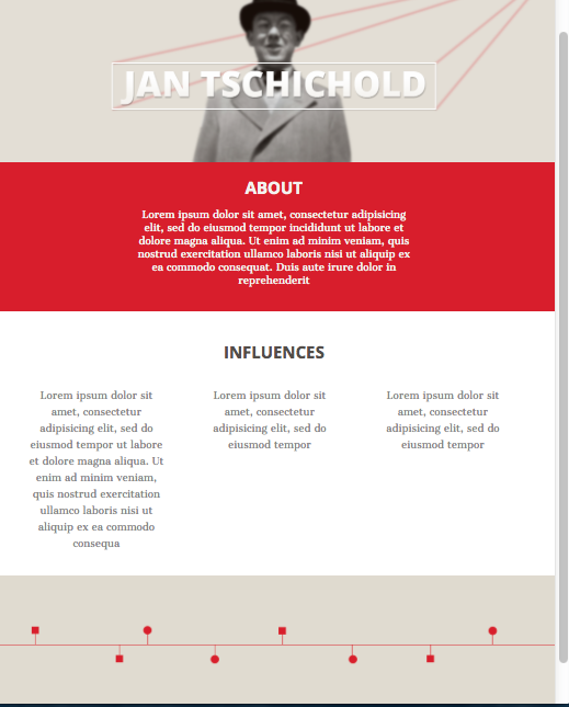
Our out of class, or rather in-class to out of class assignment for this week was to create a mood board based on our artist. This mood board needed to portray the feeling of our artist/designer but without using any of their works, images, or related materials. For my artist, Jan Tschichold, I decided to create a mood board that reflected the techniques I learned by researching Jan's works, including posters and books. Using a modern, clean style of design, I constructed a mood board that portrays his style with elements of line and old fashioned photographs. Tschichold was very well known for constructing some of the first well-known texts on design principles especially when talking about typeface composition and construction. I believe my mood board reflects Tschichold's works and overall feeling.


Monday, November 4, 2013
Week11A
Today in class we went through another tutorial about CSS to extend our CSS knowledge and know-how. Using a previously created html web page we were to follow along a tutorial and edit the CSS code as well as the HTML code as the tutorial requests. I learned a lot of new things including how to use Class and ID selectors and what the difference between the two are, grouping and nesting, which is extremely helpful, especially once it comes to writing really large CSS documents, it will help with the organization and readability of your documents. We also learned about pseudo classes, which is like mini classes within a class, such as having different functions within a link tag: a:link or a:hover. I especially enjoyed the input:focus, text area:focus dynamic pseudo class because it is a more exciting way to hover over links rather than the text color changing, it sort of highlights it, which seems to be a trend right now. Another key thing I learned today was shorthand coding, which again helps with organization and simplicity of your CSS document. When using shorthand coding you don't have to specify each thing, you just line everything up in order like so: font: italic bold 12px/2 courier;, rather than doing each element, font, font-style, font-size on their own lines. The last thing that I found very interesting was the positioning ability of CSS when using absolute position as well as floating elements. This helps to create more exciting elements that don't exactly have to sit on a certain framed box but rather can float anywhere you tell it to.
The product of all this coding isn't too attractive or exciting, but the practice of using the new learned codes and seeing what it does on the front end was definitely interesting. My code and final page layout can be found below:


Jan Tschichold
Jan Tschichold, a visionary and typeface genius did not only
heavily impact the area he grew up in, Leipzig, Germany, but impacting the
world of design and typeface designers around the world. Growing up as the song
of a script writer, Franz Tschichold, he was exposed to typefaces, mainly old
scripts, at a very early age. According to Linotype.com’s “In Honor of the 100th
Birthday of Jan Tschichold” article, he was already beginning to excel in
scripts and typefaces by the age of 14, when he began teaching.
Jan was influenced greatly by Calligraphers and Ornamental
Scripters such as Edward Johnston and Rudolf von Larisch early in his career.
It took him a while to decide what he wanted to be growing up, but he
eventually settled on being a professional type designer and setter and began
attending the Academy of the Graphic Arts in Leipzig. As a student he was
immersed in his craft and excelled greatly at it. At only 19 years old his
professors were asking him to help teach some script writing classes to the
school’s students, and was avidly working on commissioned pieces for his home
town, Leipzig.
Tschichold was especially brilliant due to his ability to
recognize faults in the current design world where authors and book designers
were poorly laying out type and content. Taking these faults and developing new
ways and new teaching of how to solve typeface problems and layouts was what
made Tschichold begin to become more popular than he’d ever believe. His first
publication, “Elementary Typography” was the first how-to guide to Tschichold’s
design beliefs, which included the studies of symmetrical setting, abandoning
traditional design rules, and his avid attention to sans serif fonts. This
publication raised a lot of eyebrows, causing many people to fall in love with
his work, as well as many people becoming furious about his views.
After moving to Berlin and later Munich to pursue his
typography career, Jan soon found himself up against a massive obstacle, and a
powerful one; the Nazi Government. They did not agree with his style of design,
especially when he was designing posters in the Bauhaus style. He then was
forced to flee Germany and settled in Switzerland where he needed to begin a
new, hardship ridden live, where work was unappealing and opportunities were
slim. In this time he worked a few jobs to stay afloat, did commission works on
the side, and focused a lot of his time on writing another book.
Tschichold was beginning to become much more popular now and
was contacted by some big names in the book world such as Oliver Simon, a
famous book printer, and Penguin Publishing, a internationally known book
publication. At this job he was assigned to completely redefine their current
typesetting and style. After working there in London as these world renowned
publication houses, he moved back to his home in Switzerland and began
developing some of his greatest masterpieces which include his famous book
“Master Book of Typefaces” and his most notable typeface, “Sabon”.
Sabon was a typeface that could stand the test of time, even
after Tschichold’s death in 1974. The typeface was elegant, sophisticated and
screamed a classic. It was designed in various formats such as Bold, Italics,
Bold Italics, Roman, and OsF. Tschichold’s contribution to the design world in
unarguable, and he will remain one of the greatest impacts to the world of type
over his extended and excited career.
Bibliography
"In Honor of the 100th Birthday of Jan
Tschichold." Linotype Font Feature. N.p., n.d. Web. 04 Nov. 2013.
Week10_Out_of_Class
Our out of class assignment for week10 was to utilize the CSS tools that we learned in class to edit our site that we had made the previous class and begin styling it using various tags and assigning features to each of those tags such as colors, borders, paddings and spacing adjustments.

Subscribe to:
Posts (Atom)